Disability Parking Placard Application Redesign
Bringing ease and empathy to Michigan's accessible parking application.
Role
UX Researcher & Designer
Timeline
May 2025 - June 2025
Introduction
Since they were first offered in 1949, disability parking placards have supported disabled Michiganders in accessing employment, housing, healthcare and more. However, barriers in the application process prevent some eligible individuals from accessing this critical accommodation.
This project was inspired by my personal experience applying for a disability parking placard in Michigan. I completed this work in SI 511: Design Justice, a month-long course led by Dr. Matthew Bui at the University of Michigan's School of Information.
Project Scoping
Given this project was completed as part of a four-week intensive course, I focused on redesigning the application individuals fill out when applying for a disability parking placard in Michigan. I centered the project on the following problem statement:
Problem Statement
How might we reduce the barriers applicants face when completing the application form for disability parking placards in the state of Michigan?
Because this was my first time redesigning an application, I sought out training on this topic. Civilla's Applications Practicum provided a helpful overview of best practices for applying human-centered design practices to application design, based on their decade of experience in civic service design.
Identifying Stakeholders
In analyzing the problem space, I identified the following three user groups:
Applicants
Individuals who are applying for a disability parking placard
Clinicians
Medical professionals who fill out part of the form for patients
State Employees
Michigan Department of State employees who process forms
Although my goal for this project centers applicants, the usability of the application form for clinicians and state employees impacts the experience of applicants.
Research
Inspired by the second principle of Design Justice ("we center the voices of those who are directly impacted by the outcomes of the design process"), I began this project by conducting semi-structured interviews with Michigan residents who had applied for a disability parking placard or were eligible to apply.
In recruitment materials, I chose to disclosed my identity as a disabled researcher, hoping this would make participants feel more comfortable. This decision seemed to have the intended effect, with one participant sharing, “it does make me feel better knowing that I'm talking to a person with disabilities.”
From these interviews emerged three key insights:
Challenges with Clinicians
Participants reported that their doctors were undereducated on disability issues, making the medical verification segment of the form difficult
Privacy Concerns
Participants reported significant discomfort around submitting personal medical data to the state, heightened by the current political climate and fears of a federal “disability registry.”
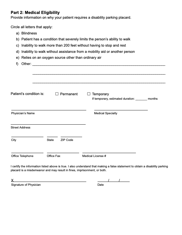
Exclusionary Eligibility Language
The form’s list of qualifying disabilities did not reflect all experiences, forcing applicants to “find workarounds” to fit within limited categories.
A note on scope: Given this project was completed during a 4-week accelerated course, I chose to focus my research on the experiences of applicants. Future research would be required to understand the experiences of clinicians and state employees.
Design Process
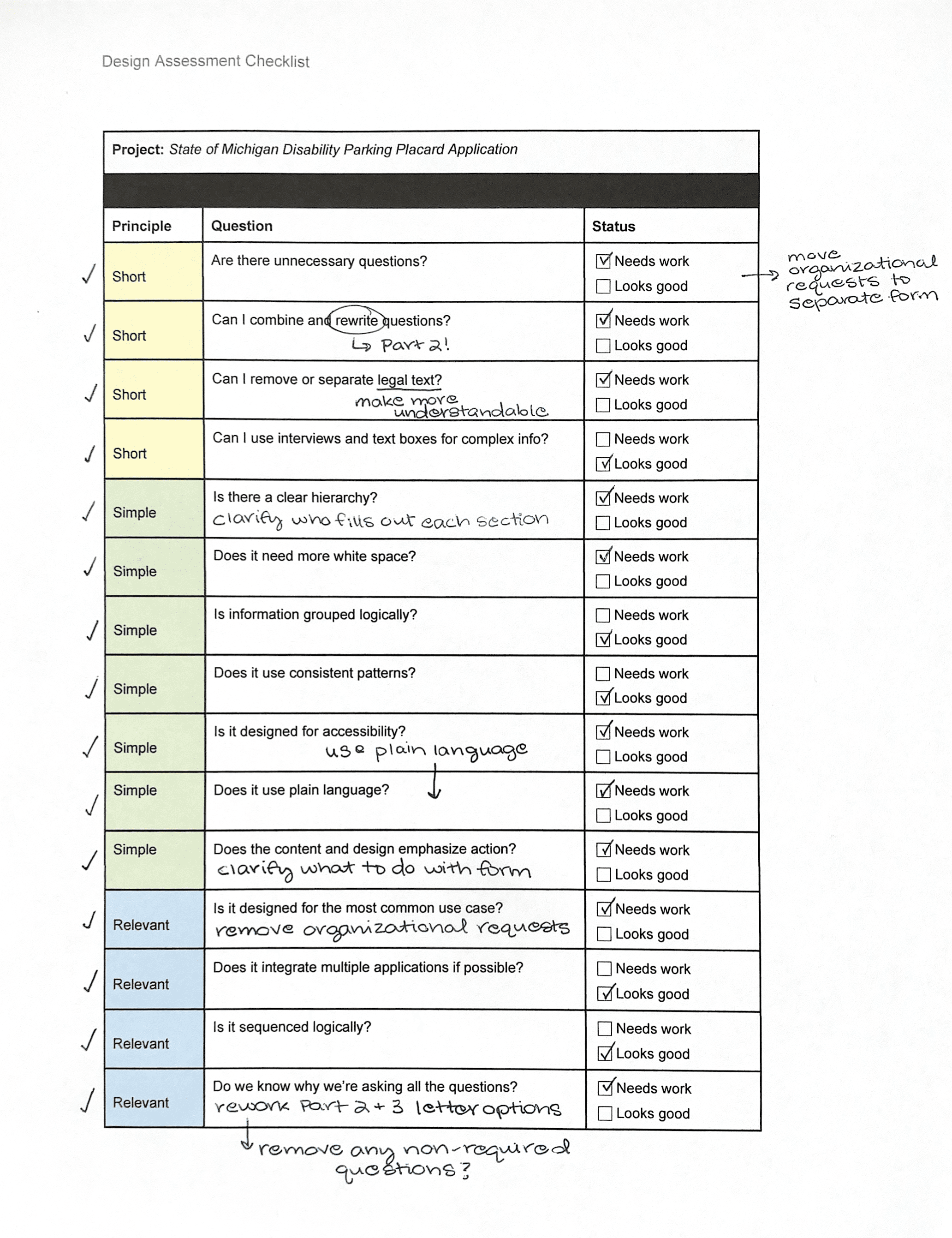
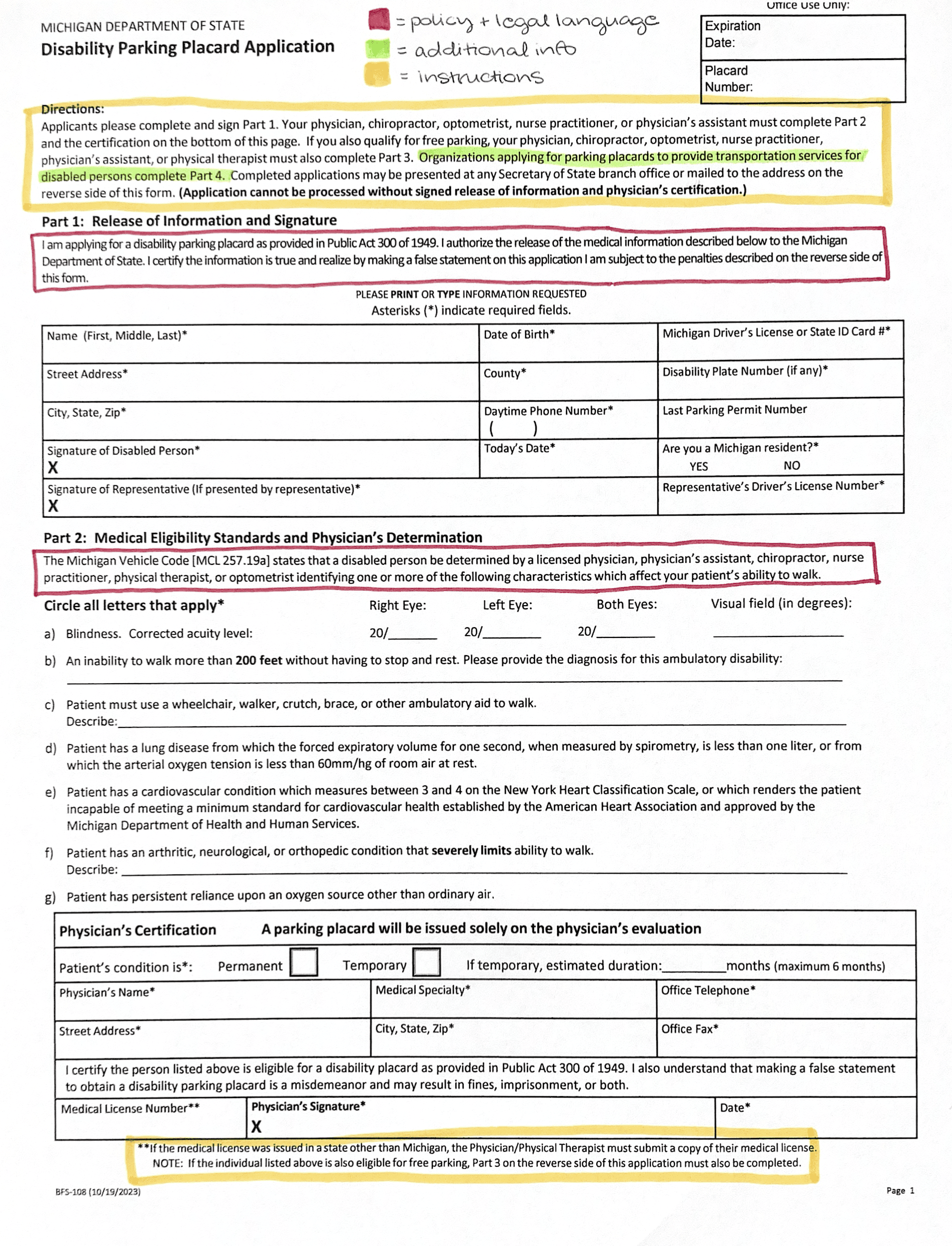
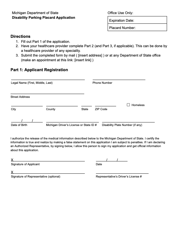
I began the design process with a heuristic evaluation of the original application using Civilla's design assessment checklist. I also categorized text on the form into three categories: instructions, policy and legal language and additional information.
Prototyping
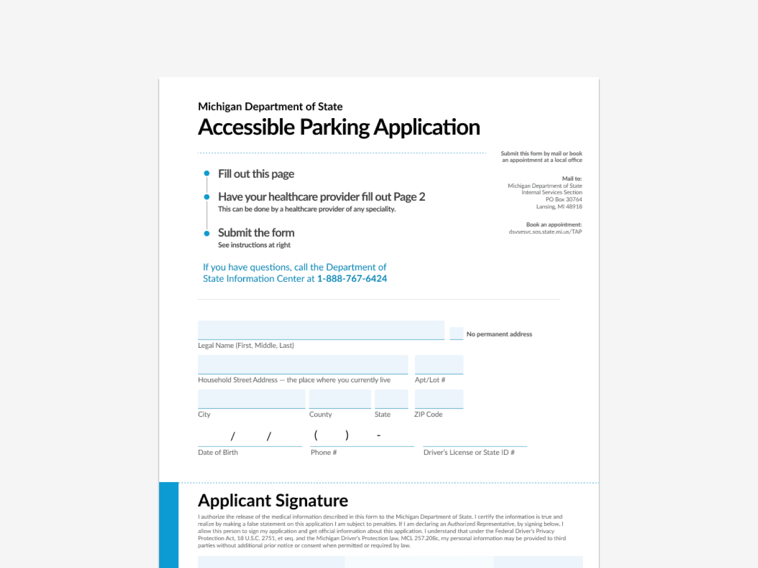
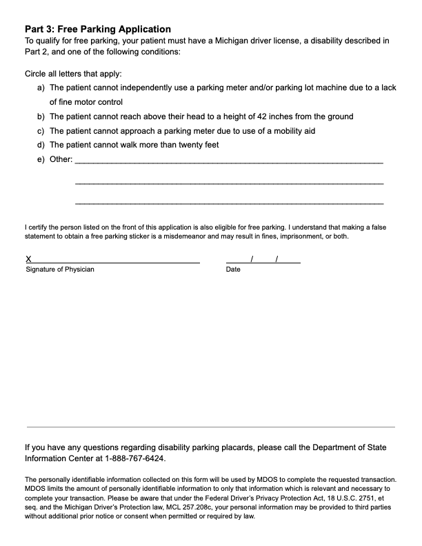
Based on findings from my interviews and heuristic evaluation, I created a mid-fidelity prototype. I improved upon the original form by increasing white space, reducing text and adding directions. Most importantly, I added an "other" section in Parts 2 and 3 for applicants who require accessible parking but whose diagnosis does not fall within the provided categories. This type of change would likely need to be legislative, but given this project was only pilot meant to inspire change, not a final product, I included this edit.
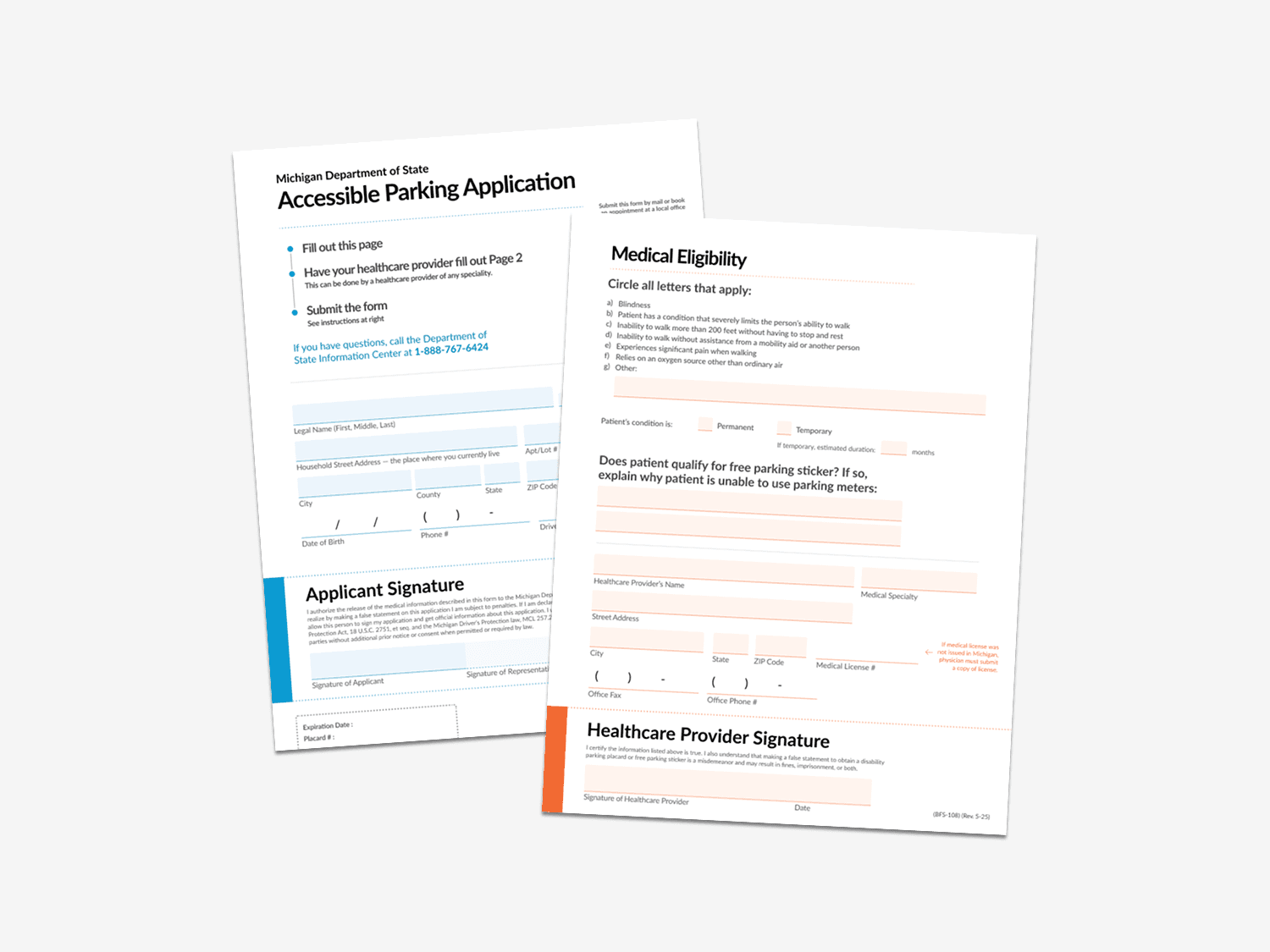
I solicited peer feedback on the mid-fidelity prototype from my classmates and was encouraged to make the instruction section more distinct. I utilized Civilla's application design system in my high-fidelity prototype to accomplish this:
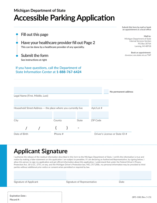
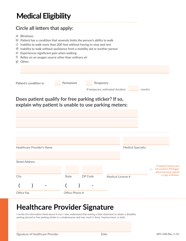
In the high-fidelity prototype, I used color to differentiate between portions of the form to be completed by the applicant versus their healthcare provider. I also added an additional category under Medical Eligibility: "Experiences significant pain when walking," as this was the most common reason my interviewees applied for accessible parking and it was not reflected in the original form's options. Finally, I retitled the application "Accessible Parking Application," allowing people who do not identify as disabled (as is common among older adults) to see themselves as eligible for this critical accommodation.
Impact
My prototype decreased the application's word count by 69%, demonstrating how the form could be adapted to improve readability.
Results
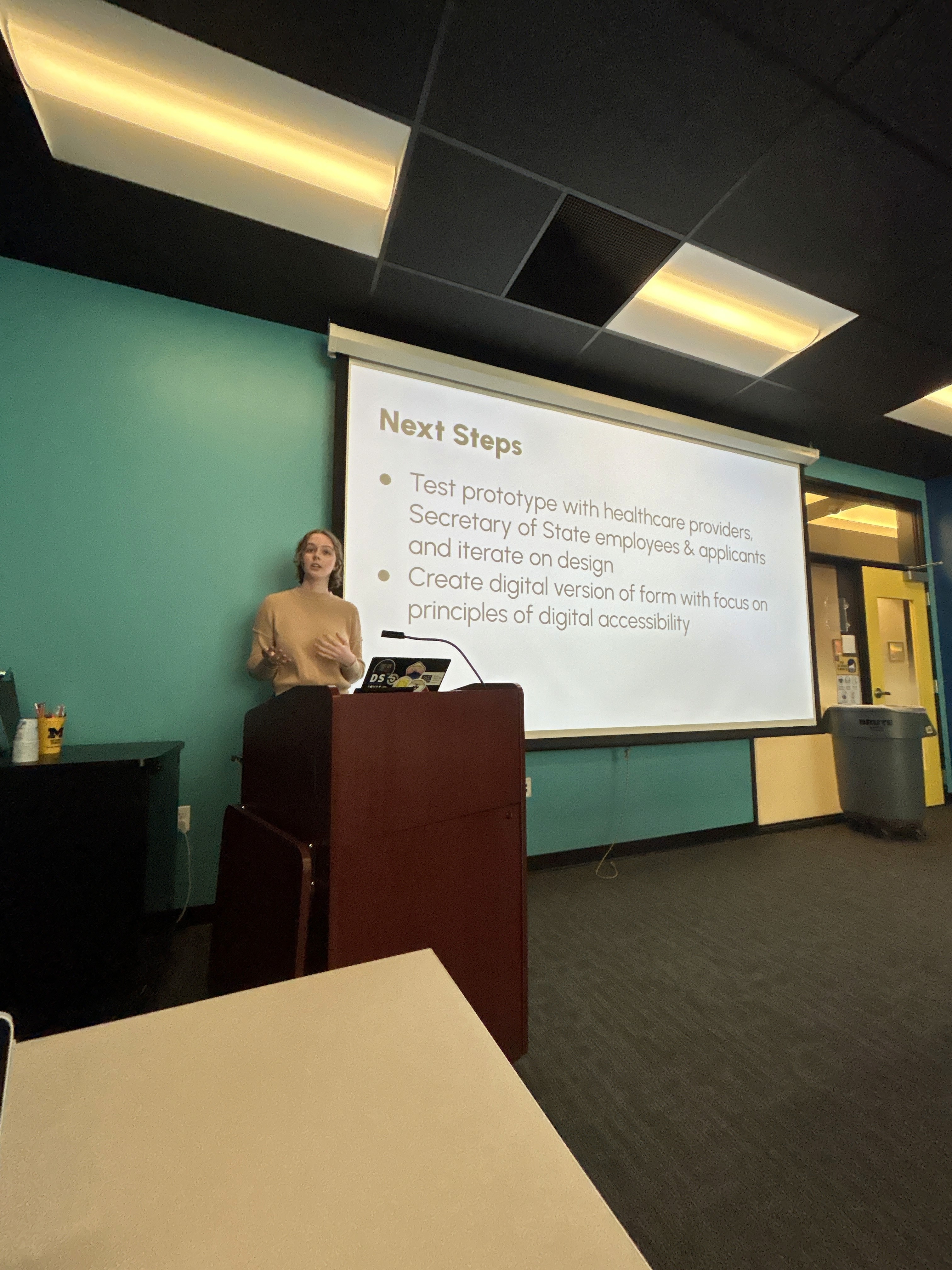
At the conclusion of this course, I presented my work to my peers, instructor and guests from Detroit Disability Power. Guests had great suggestions for the future of this work, including creating a mobile-version of the application and incorporating the application into the driver's license renewal processes.
Though this project was conducted as an independent case study, I had the opportunity to share my work with Michigan's Department of State in November 2025. I am excited to see how the team might incorporate my ideas into a future redesign of this application.
Reflections
Working on this project reminded me of all of the reasons why I love research! Learning from my interviewees was the highlight of this process. This project also taught me to push back against perfectionism. Completing a project in 4 weeks challenged me to adapt typical UX processes to tight timelines and focus on prioritization. I am confident these skills will be useful in my future work.